|
|
Post by Hunter on Oct 19, 2010 19:49:30 GMT
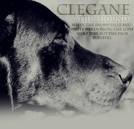
Type of art: a posting table Character's Name: Clegane - "The Hound" Tagline: When the snows falls and white winds blow, the lone wolf dies, but the pack survives. If you can't protect yourself, die and get out of the way of those who can. Sharp fangs and strong canines rule this world, don't ever believe any different. (I would like both of these if it’s possible – the first on the top, the second on the bottom) ((please don’t make the text too small – I’ve looked on your other posting tables, and the text is so small that I can hardly read it ^^’)) Breed of Animal: Beauceron – a French domestic dog race Background: link It’s the text I’m interested in – hope you can see it. Colour Scheme: dark tones – some grey, black, white colors Specific Images: It could be nice if it’s a black/white photo, but I don’t have any specific images – and it also depends on how the background is. Just make sure you can’t see the dog’s left side (unless the face is in shadows or something) because Clegane has his burning scar on the left side of his face. Theme: proud, soldier/war, hate toward felines, anger, fearless Link to bio: CleganeAny Special Effects: Whatever you think is best. But no glamorous, sparkling things – could maybe be nice if it’s pretty rough (: I hope not that this posting table is too difficult to make! x3 |
|
|
|
Post by ♥Picasso on Oct 20, 2010 18:17:19 GMT
Hmm I think I get what you mean, but I'm not quite sure by what you mean with the background. You want a background to be text? I'm not sure how you'll be able to see the other text (the name and the tagline) with a background that is already text? :3 |
|
|
|
Post by ♥Picasso on Oct 20, 2010 18:48:29 GMT
[atrb=border,0,true][atrb=cellSpacing,0,true][atrb=cellPadding,0,true][atrb=width,450,true] | [atrb=background,http://i34.photobucket.com/albums/d146/---Kirstie---/cleganemiddle.png]
Here you go! As aforementioned, I had no idea what to do with the background, so I just went on without it. I hope you like <3 Tell me if you want me to redo it for some reason XD
"Speech!"
|
[/size][/blockquote][/blockquote][/color][/td][/tr][tr][td]  [/td][/tr][/table][/center] [center][table][tr][td][atrb=border,0,true][atrb=cellSpacing,0,true][atrb=cellPadding,0,true][atrb=width,450,true][img]http://i34.photobucket.com/albums/d146/---Kirstie---/cleganetop-1.png[/img][/td][/tr][tr][td][atrb=background,http://i34.photobucket.com/albums/d146/---Kirstie---/cleganemiddle.png][color=4c4c4c][blockquote][blockquote][justify][size=1]
Here you go! As aforementioned, I had no idea what to do with the background, so I just went on without it. I hope you like <3 Tell me if you want me to redo it for some reason XD
[color=black][b]"Speech!"[/b][/color]
[/justify][/size][/blockquote][/blockquote][/color][/td][/tr][tr][td][img]http://i34.photobucket.com/albums/d146/---Kirstie---/cleganebottom-1.png[/img][/td][/tr][/table][/center] |
|
|
|
Post by Hunter on Oct 20, 2010 18:58:40 GMT
I see what you mean - hadn't thought about that, so no problem ^^ And I really like him, thanks! :b But is the taglines too long? Just because there isn't space between some of the words - sorry if I'm too much a perfectionist ^^' just a minor detail
|
|
|
|
Post by ♥Picasso on Oct 20, 2010 18:59:43 GMT
Whatcha mean with the space? I centred it to make it look cleaner if that's what you mean. And you can choose if you want to shorten it, but I don't think it looks too bad (: |
|
|
|
Post by Hunter on Oct 20, 2010 19:05:36 GMT
It's just between strong canines and white winds ^^'
(hate to criticize other's work xD)
|
|
|
|
Post by ♥Picasso on Oct 20, 2010 19:08:02 GMT
LOL wow, I'm blind. Hang on I'll change it.
Okay, changed it on original post. I didn't actually notice that ;P thanks for pointing it out! Twasn't criticising <3 |
|
|
|
Post by Hunter on Oct 20, 2010 19:50:38 GMT
Thank you very much! :b
|
|